Is the pen mightier than the picture?
My daughter is thinking up activities for her students and tells me about this series that The New York Times is carrying. It is called ‘What’s Going On in This Picture’. Photographs stripped of their captions are posted and we have to look at them and say what they are about, and why we think so. The original captions are revealed much later.
This sounds like a lot of fun, but for me there is also a sub-text to it that feeds into the debate whether ‘Words are more important than the visuals’. I have had heated arguments with my design colleagues who often asked me to cut down on the wordcount of my prose so that they could use more images on the page. Their reason – the page has to be visually appealing. People look at the pictures first and are then drawn into reading the articles.
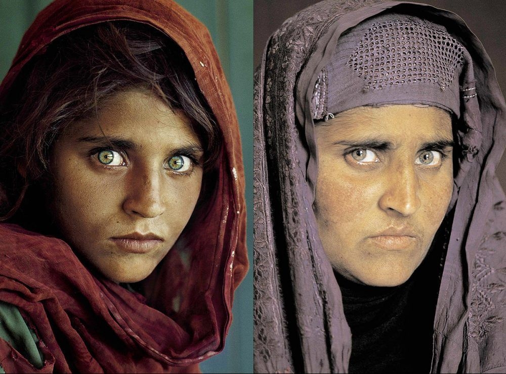
That cannot be denied. I can think of examples of photographs that still haunt me. Steve McCurry’s “Afghan Girl” that was the cover of a National Geographic magazine in June of 1985. Just a picture. There was no other information the photographer had provided and none was needed as her photograph had already captured the imagination of the world. It became so iconic that it compelled McCurry to set off on another expedition to look for that girl. And some 17 years later, the story about her was written.

One may argue that like art, photographs are open to interpretation too. May be so. But, there is a very real and present danger of misinterpretation. I remember at a workshop, our writing mentor giving the following example. There were two photographs taken after a hurricane had hit the American town. One of them showed white Americans carrying away food from a shop, and the caption said they had purchased essentials. Another photograph showed Black Americans doing the same and the caption of that photograph said looting had become rampant in the aftermath of the storm. That is telling. That is bigotry of the writer coming into play. The photographs needed some caption, and without any research, history, investigation, the damning words were put down.
So, left to individual interpretations, visuals sans words do not always work that well. Sometimes they do, like it did with The Afghan Girl. The words describing that visual came years and years later. Till then we knew little about her. Not even her name. Many probably enjoyed weaving their own stories in their heads about that young girl with the beautiful eyes.
It also depends on what context we are speaking of visuals and words. There are pictures that make a strong statement. It could be a political comment, a humanitarian one, an emotional response to something… Other times just a visual is not enough to drive home the point. It needs a context and that context is provided by the words. There needn’t be an ocean of words. Just a few to nudge the viewer into seeing what the photographer wants her to see. That is where good writing comes into play.

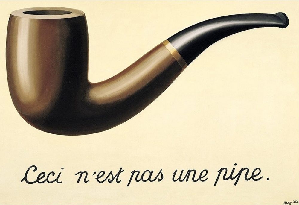
The Treachery of Images by René Magritte
So I guess the argument is not about which is more important. It should be about how visuals and words complement each other, support each other and enhance the impact they have.
I give below a link to an article that appeared in the Guardian called ‘This land is just dirt’: a rooftop view of Jerusalem. Amazing pictures. But would they be as impactful if we did not know where they were taken and why?
https://www.theguardian.com/cities/2017/oct/23/jerusalem-rooftop-divided-israel-season-culture
About the Author
Pankaja Srinivasan
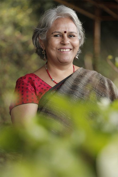
Pankaja Srinivasan is a recently retired Senior Deputy Editor with The Hindu in Coimbatore for fourteen years. Before that she has been with several National dailies and magazines, besides doing freelance work. She enjoys reading and is currently also wrapping up a cookbook she has been working on for far too many years.
